The State of Durango, in northern Mexico, is one of those affected with significant natural presence of arsenic in groundwater. One of the problems with studying arsenic is that it’s expensive to measure it accurately. But what if we could reliably predict the arsenic content of a water sample, based on other characteristics of the water that are easier to determine?
I set out to determine which other features of groundwater are most closely associated with arsenic (As) levels, hoping to find a cheaper indicator that is strongly associated with As. I used a dataset of water samples from Durango for which the levels of several common ions have been quantified. I used feature selection, with and without polynomial expansion, to narrow the search. I then used partial dependence plots and Shapley values to further determine the contributions of individual dataset features to the overall prediction.
Though the dataset is small (only 150 samples), it was enough to see that potassium (K) is by far the factor most closely associated with As, followed by fluoride and pH. You can see the full code that went into these calculations in the several notebooks in this Github Repo.
Potassium (K) is the most important feature
This dataset was gathered by researchers at the Advanced Materials Research Center (CIMAV) in Durango. It contains 150 rows and 15 columns.
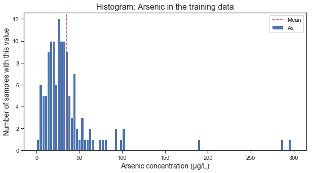
The distribution of As in the samples is almost normal, with a few outliers of super-high concentration. I used robust scaling throughout my analysis to correct for those outliers.
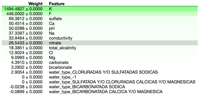
I started out with ridge regression and feature selection (selectkbest). Of the original features in the data, the lowest root mean square error (RMSE) under cross-validation comes from using just three features: pH, fluoride (F) and potassium (K), with K as the most important.
Best parameters from cross-validation:
ridge__alpha: 10.0
selectkbest__k: 3

Selected Features and regression coefficients:
pH   11.62
F    14.26
K    20.44
I looked for higher-dimensional interactions using polynomial expansion. I added all the possible x^2 features, and ran the ridge regression + feature selection pipeline again. The results further highlighted the importance of potassium. K is the most significant feature on its own, it shows up as K^2, and the other features seem to matter only inasmuch as they interact with K (though there’s also the interaction between F and conductivity).
Best parameters from cross-validation:
ridge__alpha: 1.0
selectkbest__k: 7

Selected Features and regression coefficients:
K                   -44.68
pH K                16.85
conductivity F      8.36
F K                 4.10
K^2                 29.12
K bicarbonate       0.20
K total_alcalinity  -4.90
Fluoride (F) is close second
An intuitive way to calculate feature importance is to take a feature, shuffle its values, and measure how much the overall model performance decreases. This Permutation Feature Importance (PFI) is thus a model-independent approach to feature importance. I used the PFI implementation in the package ELI5, and found that the results suggest the same as the regression coefficients.
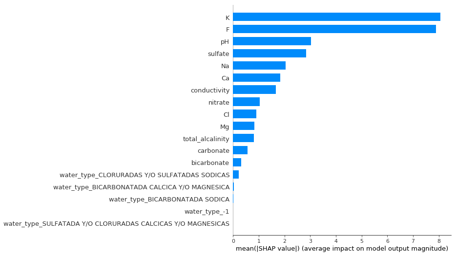
Another way to calculate the importance of various features is to calculate their Shapley values. These values measure the average marginal contribution of a feature to the final prediction, across all possible combinations of features. When calculated evaluated for all datapoints on average, the Shapley value gives usa good measure of the importance of a feature. When calculated for an individual data point, it tells us which features contributed the most to to the model’s prediction in that particular case. I used the package SHAP to calculate the overall Shapley values for the features in this dataset. The results reiterate the importance of K, but also emphasize F more thanthe previous methods would suggest.
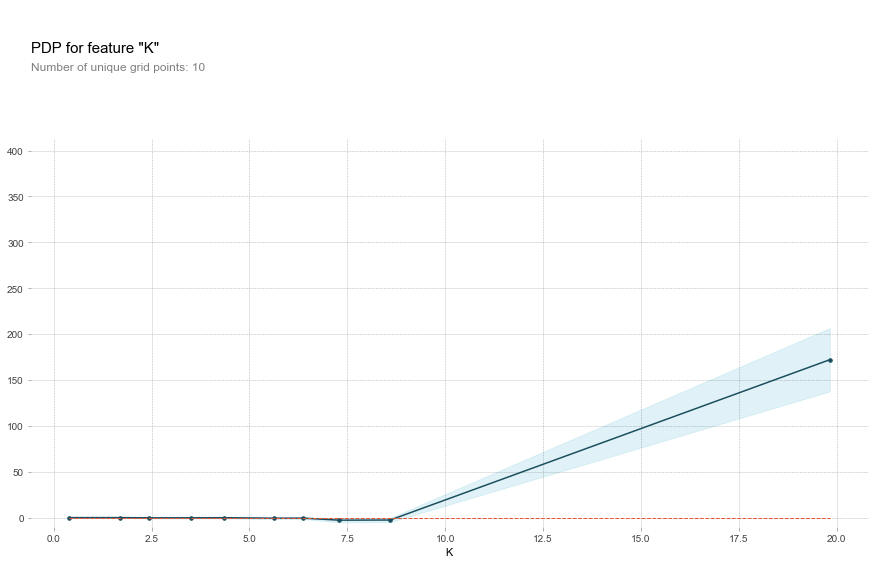
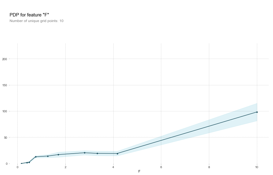
Potassium and Fluoride are most predictive at high concentrations
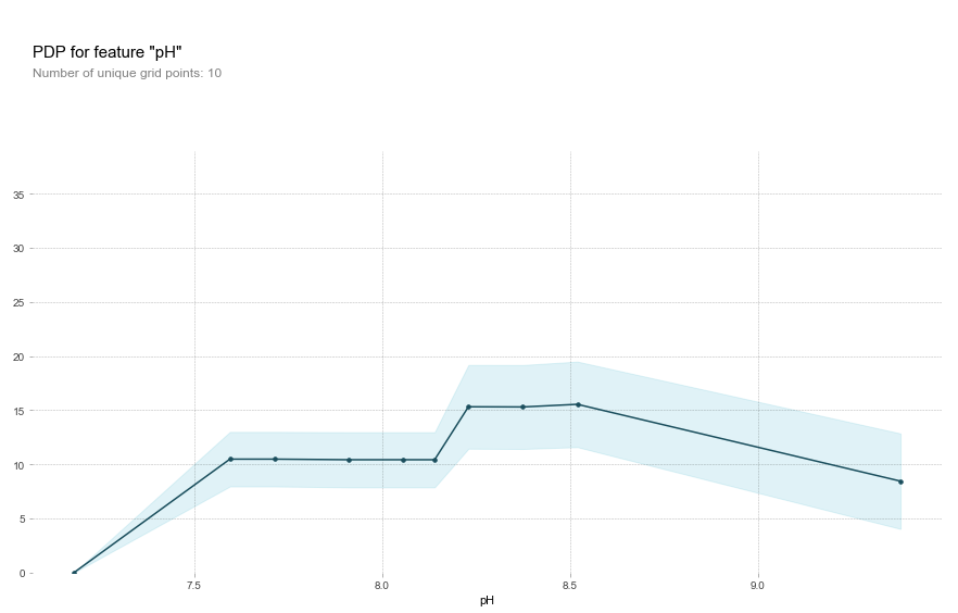
Knowing that K and F were the most important features, I wondered what else I could find out about their contribution. Are they more closely associated with As at high or low concentrations? Partial dependence plots are a great way to visualize just that. They are a general way of visualizing the marginal effect of a feature on the results of a machine learning model. A PD plot can show you whether the feature’s relationship with the target is linear, monotonic, or more complex. I used the convenient package PDPbox to create PD plots for the most important features identified before.
Potassium actually has zero predictive power over As until a concentration of about 9 mg/L, at which point it becomes important.
Fluoride behaves similarly, though it has a non-zero contribution until the inflection point at 4 mg/L.
This is all in contrast to, for example, pH, where the most influential range is in the mid-basic range rather than at the extremes.
This model might be affected by outliers
One thing worried me throughout this analysis. There are some samples with really extreme values of various ions, and I worried whether those measurements could have an undue distortion in a dataset as small as this one. In order to investigate this possibility, I calculated Shapley values for individual datapoints and displayed the contributions of particular factors on a force plot. The force plot below is for one of the data points with the greatest error. It shows how much the value of all the features at that point contributed to the model’s prediction in that case. (In this case, the model is a gradient boost regression). Note how potassium (K) is by far the feature that most contributed to the high prediction and therefore the high error.
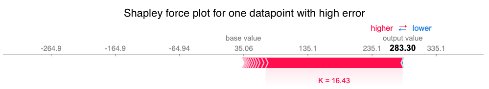
In fact, when I look at the top 20 points with the highest overall error, I can notice how the five points with the highest K values also had by far the highest Shapley values for K (that is, K contributed the most to the model’s predictions for that point). Since these are the points with greatest error, it seems that the model is thrown off by the cases with super-high potassium.
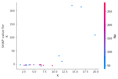
Next steps for this analysis would be to remove severe outliers like this and see whether that can improve the model’s predictions. It would also be advisable to take a deeper look at the exact nature of the outlying points, as with a dataset this small we really can’t afford to throw out too much of the data. Furthermore, the outlying cases might be the most interesting because these are contaminants we’re talking about. It could well be that the most contaminated wells, the outliers, are mostly responsible for the public health concerns that motivate this analysis in the first place.