For anyone used to data science with pandas, GeoPandas is the simplest way to perform geospatial operations and (most importantly) visualize your geographic data. GeoPandas saves you from needing to use specialized spatial databases such as PostGIS. This cookbook contains the recipes that I’ve found myself using over and over again with GeoPandas, many of them cobbled together from bits scattered throughout Stack Overflow and the official documentation.
When you start out, make sure to scan the official GeoPandas documentation and this great course from the University of Helsinki. Happy mapping!
Make a GeoDataFrame from coordinates
If your pandas DataFrame contains columns for latitude and longitude, you can turn them into a list of Shapely.point objects and use that as the geometry column of a new Geopandas GeoDataFrame.
def make_geodf(df, lat_col_name='latitude', lon_col_name='longitude'):
    """
    Take a dataframe with latitude and longitude columns, and turn
    it into a geopandas df.
    """
    from geopandas import GeoDataFrame
    from geopandas import points_from_xy
    df = df.copy()
    lat = df['latitude']
    lon = df['longitude']
    return GeoDataFrame(df, geometry=points_from_xy(lon, lat))
If you have a set of points that you want to turn into a polygon, use the Shapely library. The Polygon constructor can take an array of lat/lon tuples and produce a Polygon. A list of Polygons, much like a list of Points, can be used to make the geometry column of a GeoDataFrame.
from geopandas import GeoDataFrame
from shapely.geometry import Polygon

# Turns array of lat/lon tuples into a single Polygon
poly = Polygon([array_of_lat_lon_tuples])

# Turns a DataFrame into a GeoDataFrame, using an array of
# Polygons as a geometry column.
geodf = GeoDataFrame(df2, geometry=array_of_polygons)
Import pre-made maps
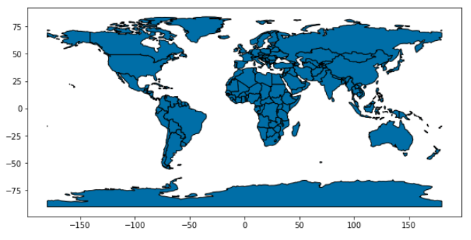
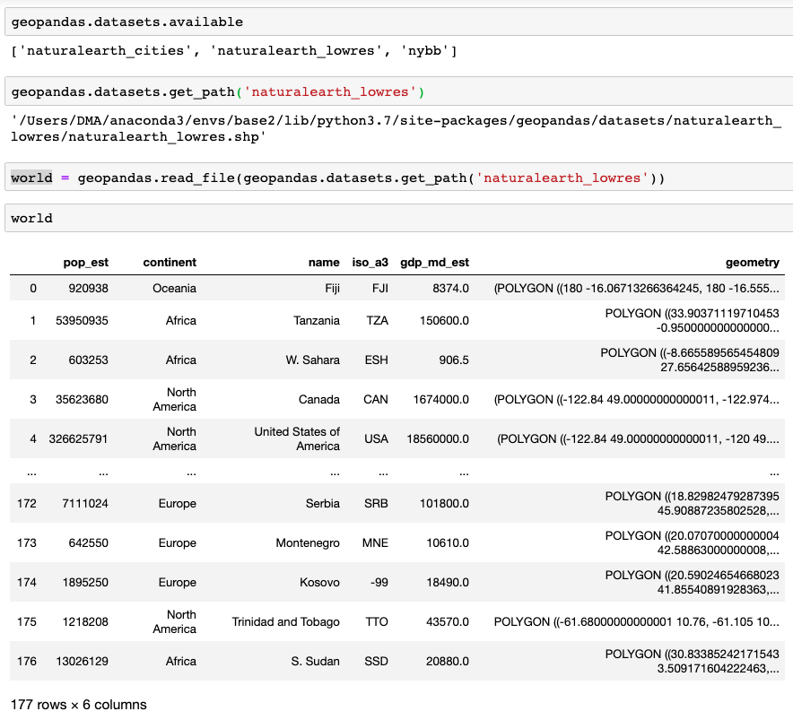
GeoPandas comes with three pre-made maps that are already on your computer if you installed the package. Once loaded as GeoDataFrames, these maps contain the Points for several major cities or low-resolution Polygons for the borders of all countries. Make sure to check how your particular country is spelled. The relevant commands are:
# Returns names of available maps
geopandas.datasets.available
# Returns path of a particular map
geopandas.datasets.get_path('naturalearth_lowres')
# Opens the map as a GeoDataFrame
world = geopandas.read_file(geopandas.datasets.get_path('naturalearth_lowres'))
# Subsets the GeoDataFrame
usa = world[world.name == "United States of America"]
# Plots
world.plot();
Note how the maps also contain some other useful information like GDP and population.
For most tasks, though, you’ll want to upload a map of your own. If it is defined as a GeoJSON file or a folder of SHP files, GeoPandas can read them directly. Feed either the path to the GeoJSON file itself or the path to the folder of SHP files.
geodf = geopandas.read_file('PATH/TO/custom_map.geojson/')
geodf = geopandas.read_file('PATH/TO/folder_with_SHP_files/')
Chloropleths
A GeoDataFrame can contain points or polygons. Both will be rendered automatically with geodf.plot(). If you plot a GeoDataFrame with Polygons in the geometry column, you can use the parameter column to assign each polygon a color based on the (numerical) value of that column. Here I also used a trick from the AxesGrid toolkit to add a custom colorbar.
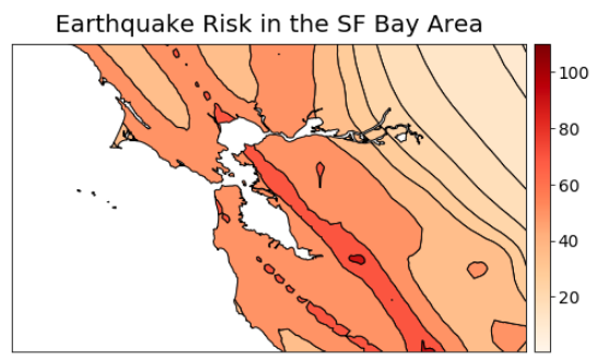
from mpl_toolkits.axes_grid1 import make_axes_locatable
from matplotlib.ticker import StrMethodFormatter
fig, ax = plt.subplots(figsize=(8,8))
# Sets axes limits in lat/lon
ax.set_xlim(-123.5,-121)
ax.set_ylim(37,38.5)
# Removes ticks and labels for lat/lon
ax.tick_params(
axis='both', bottom=False, left=False,
labelbottom=False, labelleft=False)
# make_axes_locatable returns an instance of the AxesLocator class,
# derived from the Locator. It provides append_axes method that
# creates a new axes on the given side of (“top”, “right”,
#“bottom” and “left”) of the original axes.
divider = make_axes_locatable(ax)
cax = divider.append_axes("right", size="3%", pad=0.1, label='Title')
# Plot the GeoDataFrame as a chloropleth
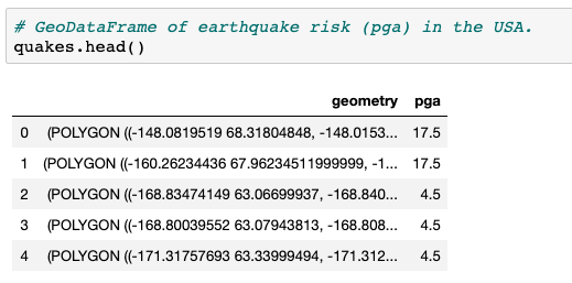
quakes.plot(ax=ax,
column='pga', # Column that determines color
legend=True,
cax=cax, # Add a colorbar
cmap='OrRd', # Colormap
edgecolor='black')
# Format colorbar tick labels
cax.yaxis.set_major_formatter(StrMethodFormatter('{x:,.0f}'))
# Set the fontsize for each colorbar tick label
for l in cax.yaxis.get_ticklabels():
l.set_fontsize(14)
ax.set_title('Earthquake Risk in the SF Bay Area', fontsize=20, pad=10);
Bubble plots
GeoPandas maps can be stacked as layers of varying transparency in a regular matplotlib axes. If you then plot a dataset on top of the map, using lat/lon as the values of x/y, you can produce bubble plots that are very information-rich. Here is an example that shows the average arsenic concentration for sampling sites in several major cities of the state of Durango, Mexico.
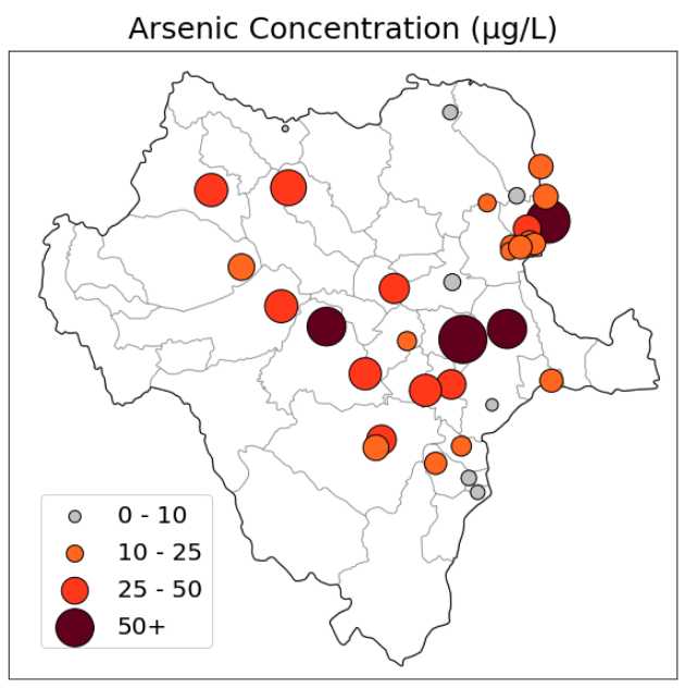
# GeoDataFrame of cities with their average arsenic concentrations
# (column 'arsenic', float) and a custom color category that corresponds
# to different contamination levels (column 'colors_as', string)
cities = cities_dgo2.dropna(subset=['arsenic'])

# The size of the markers (area) is a multiple of that city's
# arsenic concentration
markersize = cities['arsenic'] / 10 * 200

fig = plt.figure(figsize=(10,10))
ax = fig.add_subplot(1,1,1)

# Plots the outline of the state
durango_state.plot(ax=ax, color='white', edgecolor='black', linewidth=1);
# Plots the outline of the municipalities, in a lighter grey tone
durango.plot(ax=ax, color='None', edgecolor='black', alpha=0.2);
# Plots the cities
cities.plot(ax=ax, color=cities['colors_as'],
            markersize=markersize, alpha=1,
            edgecolor='black')

ax.set_title('Arsenic Concentration (µg/L)', fontsize=25, pad=10);

# Removes ticks and lat/lon labels
ax.tick_params(
    axis='both', bottom=False, left=False,
    labelbottom=False, labelleft=False)
# Sets figure limits
ax.set_xlim(-107.5, -102.4);
ax.set_ylim(22.2, 27);


# The legend is generated not from the data that you see, but from
# several other layers that are plotted outside the figure (at lat=lon=0).
# This makes it easier to populate the legend box with circles of exact
# sizes and colors.

ax.scatter([0], [0], c='xkcd:silver', alpha=1, s=5/10*200,
            label='0 - 10', edgecolor='black')
ax.scatter([0], [0], c='xkcd:orange', alpha=1, s=10/10*200,
            label='10 - 25', edgecolor='black')
ax.scatter([0], [0], c='xkcd:orangered', alpha=1, s=25/10*200,
            label='25 - 50', edgecolor='black')
ax.scatter([0], [0], c='xkcd:maroon', alpha=1, s=50/10*200,
            label='50+', edgecolor='black')

ax.legend(scatterpoints=1, frameon=True,
        labelspacing=0.6, loc='lower left', fontsize=20,
        bbox_to_anchor=(0.03,0.03), title_fontsize=20);

plt.show()
Multiple legend boxes
It’s also possible to add multiple legend boxes to the same map, with patches of precise shape and color.
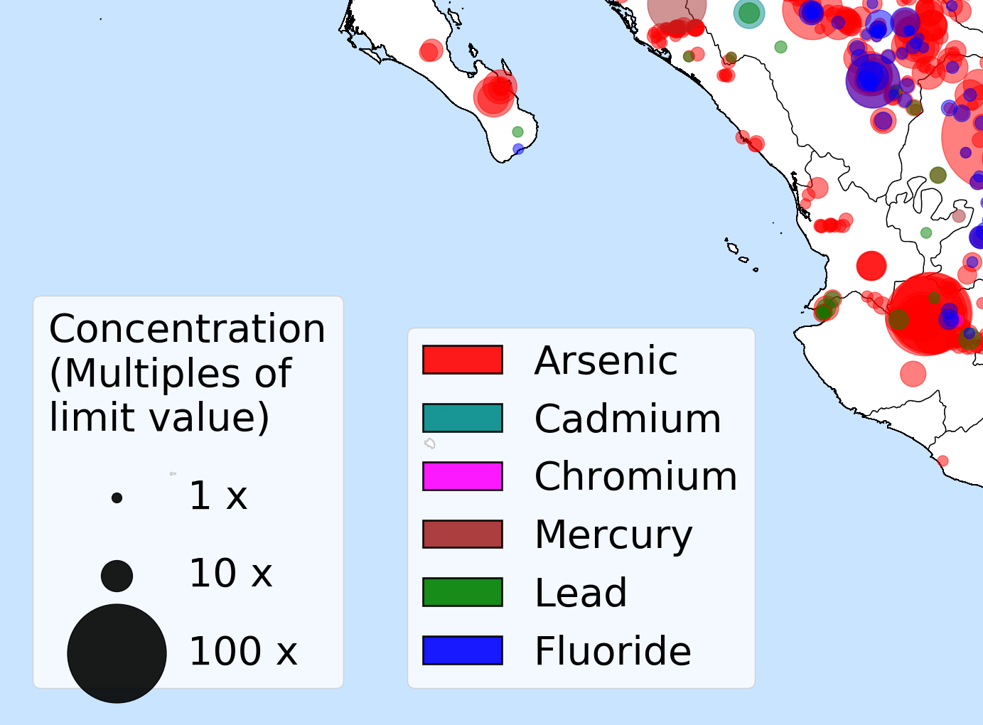
import matplotlib.patches as patches

# Adds three phantom data points to the map, plotted off-screen at lat=lon=0
for area in [1, 10, 100]:
    ax.scatter([0], [0], c='black' , alpha=0.9, s=area*100,
                label=str(area) + ' x')

# Creates the legend with black circles
legend1 = ax.legend(scatterpoints=1, frameon=True,
        labelspacing=1, loc='lower left', fontsize=40,
        bbox_to_anchor=(0.03,0.05),
        title="Concentration\n(Multiples of\nlimit value)",
        title_fontsize=40)

# Adds the legend above to the current axes in the figure
fig.gca().add_artist(legend1)

list_of_ions = ['arsenic', 'cadmium','chromium',
                'mercury','lead','fluoride']

color_dict = {'arsenic':'red',
            'cadmium':'darkcyan',
            'chromium':'magenta',
            'mercury':'brown',
            'lead':'green',
            'fluoride':'blue'}

# Creates a rectangular patch for each contaminant, using the colors above
patch_list =[]
for ion in list_of_ions:
    label = ion.capitalize()
    color = color_dict[ion]
    patch_list.append(patches.Patch(facecolor=color,
                                    label=label,
                                    alpha=0.9,
                                    linewidth=2,
                                    edgecolor='black'))

# Creates a legend with the list of patches above.
ax.legend(handles=patch_list, fontsize=40, loc='lower left',
        bbox_to_anchor = (.2,0.05), title_fontsize=45)